14 Powerful Data Visualization Tips For Google Analytics

Introduction: Unlocking the Power of Data Visualization in Google Analytics
Data visualization is a powerful tool that can transform complex data into meaningful insights, helping businesses make informed decisions and drive growth. Google Analytics, one of the most widely used web analytics platforms, provides a wealth of data that can be leveraged through effective data visualization techniques.

In this comprehensive article, we will explore 14 powerful data visualization tips that can help you unlock the full potential of Google Analytics. From creating visually appealing dashboards to leveraging advanced visualization features, these tips will empower you to extract valuable insights and make data-driven decisions.
Tip 1: Choose the Right Visualization Type
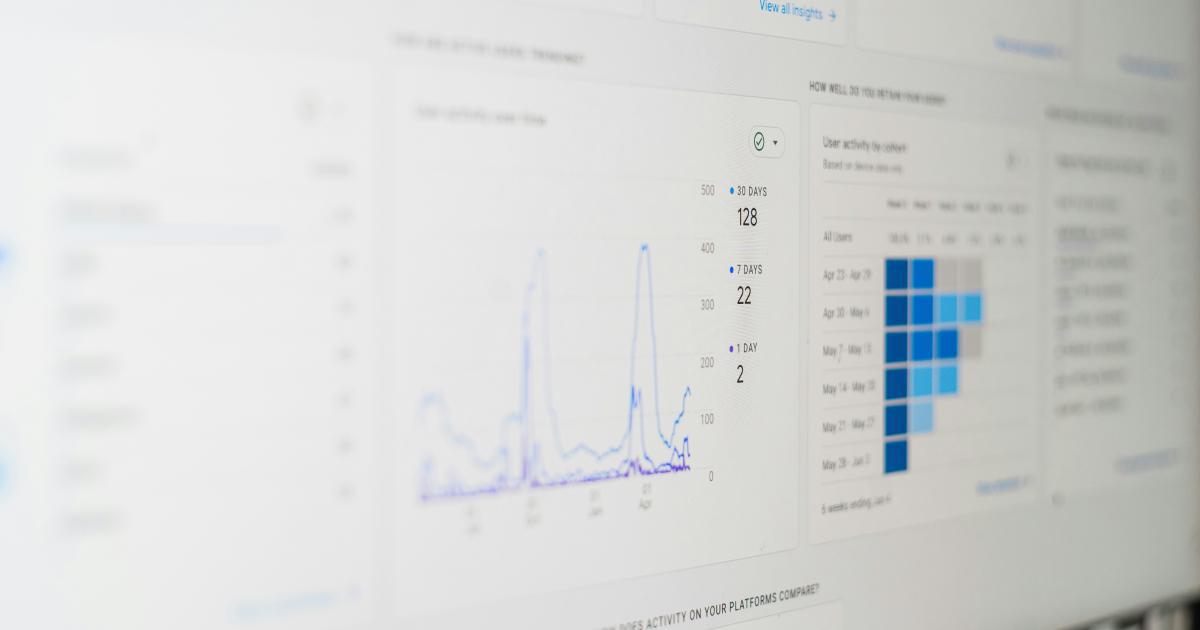
One of the most important aspects of effective data visualization is selecting the appropriate chart or graph type for your data. Google Analytics offers a wide range of visualization options, each with its own strengths and weaknesses. Understanding the characteristics of different chart types can help you make informed decisions and effectively communicate your insights.

Key Considerations:
- Line charts are excellent for tracking trends over time, such as website traffic or conversion rates.
- Bar charts are useful for comparing values across different categories or dimensions.
- Pie charts can be effective for displaying the proportional composition of a whole, such as the distribution of traffic sources.
- Scatter plots are ideal for identifying relationships and patterns between two variables.
- Heatmaps can help you visualize data concentrations and identify areas of high or low activity.
By matching the right visualization type to your data and objectives, you can create more meaningful and impactful data visualizations.
Tip 2: Optimize for Readability and Clarity
The success of your data visualizations largely depends on their ability to convey information clearly and effectively. Paying attention to factors such as font size, color choices, and labeling can significantly improve the readability and clarity of your visualizations.

Best Practices:
- Use clear, easy-to-read font types and sizes, ensuring that labels and annotations are legible.
- Opt for a balanced color palette that enhances the visual appeal and highlights the most important information.
- Provide clear and concise labels for axes, legends, and data points to help your audience quickly understand the visualized data.
- Eliminate unnecessary clutter and focus on the most relevant information to avoid overwhelming your viewers.
- Consider using annotations or highlights to draw attention to specific insights or trends within your visualizations.
By prioritizing readability and clarity, you can create data visualizations that are both visually appealing and highly informative.
Tip 3: Leverage Interactive Visualizations
Google Analytics offers a range of interactive visualization features that can enhance the user experience and facilitate deeper data exploration. Incorporating interactive elements can make your data visualizations more engaging and allow your audience to customize the display to their specific needs.

Key Interactive Features:
- Hover-over tooltips: Display additional details about data points when users hover over them.
- Drill-down functionality: Allow users to explore data at different levels of granularity by clicking on specific elements.
- Filtering and sorting: Enable users to filter and sort data based on their preferences, revealing new insights.
- Zooming and panning: Give users the ability to zoom in on specific areas of the visualization or pan across the data.
- Comparative analysis: Allow users to compare different data sets or time periods side by side.
By embracing interactive visualizations, you can create a more dynamic and engaging experience for your audience, empowering them to uncover insights tailored to their unique needs.
Tip 4: Customize Dashboards for Specific Audiences
Google Analytics provides a powerful dashboard feature that allows you to create personalized views of your data. By tailoring dashboards to the specific needs and interests of different stakeholders, you can ensure that each audience receives the most relevant and actionable insights.

Considerations for Customized Dashboards:
- Identify the key metrics and dimensions that are most important for each stakeholder group (e.g., executives, marketing team, e-commerce managers).
- Arrange the dashboard layout and visualization types to optimize the presentation of the most crucial information.
- Incorporate interactive elements, such as filters and date range selectors, to enable personalized data exploration.
- Save and share the customized dashboards with the appropriate stakeholders, making it easy for them to access the insights they need.
- Regularly review and update the dashboards to ensure they remain relevant and aligned with evolving business objectives.
By creating customized dashboards, you can cater to the unique needs of your stakeholders and empower them to make more informed, data-driven decisions.
Tip 5: Tell a Story with Data Visualizations
Effective data visualization is not just about presenting facts and figures; it's about using data to tell a compelling story. By weaving a narrative through your visualizations, you can help your audience better understand the context and significance of the insights you're presenting.

Storytelling Techniques:
- Identify the key message or insights you want to convey and use your visualizations to support and reinforce that narrative.
- Organize your visualizations in a logical flow, guiding your audience through the data and leading them to your main conclusions.
- Use annotations, text, and other design elements to provide context and guide the viewer's attention to the most important points.
- Incorporate relevant benchmarks, targets, or industry trends to help your audience better understand the significance of the data.
- Consider using a combination of different visualization types to create a more visually engaging and informative narrative.
By telling a compelling data story, you can help your audience better comprehend the insights you're sharing and inspire them to take meaningful action.
Tip 6: Optimize for Mobile Accessibility
With the increasing prevalence of mobile devices, it's crucial to ensure that your data visualizations are optimized for mobile viewing. Google Analytics provides responsive design features that can help you create visualizations that are both visually appealing and easily accessible on smaller screens.

Mobile Optimization Strategies:
- Prioritize the most critical information and simplify the overall design to ensure readability on mobile devices.
- Adjust font sizes, spacing, and layout to ensure optimal legibility and user experience on smaller screens.
- Leverage the responsive design capabilities of Google Analytics to automatically adapt your visualizations to different screen sizes.
- Consider using mobile-friendly visualization types, such as simplified line charts or bar graphs, that are easier to interpret on the go.
- Test your visualizations on various mobile devices and screen sizes to identify and address any potential usability issues.
By optimizing your data visualizations for mobile accessibility, you can ensure that your insights are readily available and easily consumed by your audience, regardless of their device.
Tip 7: Utilize Advanced Visualization Features
Google Analytics offers a wide range of advanced visualization features that can help you unlock deeper insights and uncover hidden patterns within your data. Leveraging these advanced capabilities can elevate your data visualizations and provide your audience with a more comprehensive understanding of your business performance.

Advanced Visualization Features:
- Scatter plots: Identify relationships and correlations between different variables, such as website traffic and conversion rates.
- Treemaps: Visualize hierarchical data structures, such as the distribution of traffic across different pages or categories.
- Sankey diagrams: Illustrate the flow of data or user journeys, highlighting the most significant conversion paths.
- Funnel visualizations: Analyze and optimize user conversion funnels, identifying potential bottlenecks or dropoff points.
- Geo-based visualizations: Gain insights into the geographic distribution of your website traffic or customer base.
By exploring and incorporating these advanced visualization features, you can unlock a deeper understanding of your data and uncover valuable insights that can drive strategic decision-making.
Tip 8: Leverage Segmentation and Filtering
Google Analytics provides powerful segmentation and filtering capabilities that allow you to slice and dice your data in a multitude of ways. Leveraging these features can help you gain a more granular understanding of your audience, identify specific areas of opportunity, and make more informed decisions.
Segmentation and Filtering Strategies:
- Create custom segments based on user characteristics, behavior, or acquisition sources to better understand different user groups.
- Apply filters to isolate specific data sets, such as high-value customers or traffic from a particular marketing campaign.
- Combine multiple segmentation and filtering criteria to uncover unique insights and identify targeted opportunities for optimization.
- Incorporate segmentation and filtering into your dashboards and visualizations to enable more in-depth data exploration.
- Regularly review and update your segmentation and filtering strategies to align with evolving business objectives and emerging trends.
By effectively leveraging segmentation and filtering, you can transform your data visualizations into powerful tools for data-driven decision-making.
Tip 9: Incorporate Benchmarking and Comparative Analysis
Benchmarking your performance against industry standards or your own historical data can provide valuable context and help you identify areas for improvement. Google Analytics offers features that enable you to conduct comparative analyses and incorporate relevant benchmarks into your data visualizations.

Benchmarking and Comparative Analysis Techniques:
- Identify relevant industry benchmarks or internal performance targets to provide a frame of reference for your data.
- Create visualizations that compare your current performance to historical data or industry averages, highlighting areas of improvement or decline.
- Utilize Google Analytics' built-in comparison functionality to overlay different data sets, enabling you to identify trends and make more informed decisions.
- Incorporate annotations or callouts to draw attention to significant performance variances or benchmark achievements.
- Regularly review and update your benchmarking and comparative analysis strategies to ensure they remain aligned with your evolving business goals.
By incorporating benchmarking and comparative analysis into your data visualizations, you can gain a deeper understanding of your performance and identify opportunities for optimization.
Tip 10: Leverage Annotations and Highlighting
Annotations and highlighting can be powerful tools for enhancing the clarity and impact of your data visualizations. By drawing attention to specific insights, trends, or key performance indicators, you can help your audience quickly grasp the most important takeaways.

Annotation and Highlighting Strategies:
- Use annotations to provide context, explain trends, or call out significant data points within your visualizations.
- Leverage highlighting techniques, such as color-coding or emphasizing specific data elements, to draw the viewer's attention to the most relevant information.
- Combine annotations and highlighting to create a cohesive narrative, guiding your audience through the data and highlighting the key insights.
- Adjust the placement, size, and style of your annotations and highlighting to ensure they complement the overall design and do not detract from the primary data visualization.
- Review and refine your use of annotations and highlighting over time to ensure they remain effective and aligned with your audience's needs.
By strategically incorporating annotations and highlighting into your data visualizations, you can enhance the clarity, impact, and overall storytelling of your insights.
Tip 11: Optimize for Data Accuracy and Integrity
Accurate and reliable data is the foundation of effective data visualization. Ensuring the integrity of your Google Analytics data is crucial to maintaining the credibility and trustworthiness of your insights.

Strategies for Data Accuracy and Integrity:
- Regularly audit your Google Analytics implementation to identify and address any tracking or configuration issues.
- Implement robust data validation and quality control processes to detect and correct any discrepancies or anomalies.
- Leverage Google Analytics' built-in data filtering and processing features to enhance the accuracy and reliability of your data.
- Cross-reference your Google Analytics data with other data sources, such as internal systems or third-party tools, to verify consistency and identify potential discrepancies.
- Document your data collection, processing, and reporting workflows to ensure transparency and facilitate troubleshooting.
By prioritizing data accuracy and integrity, you can build trust in your data visualizations and empower your audience to make informed, data-driven decisions.
Tip 12: Collaborate and Share Insights
Data visualization is not just a solo endeavor; it's a collaborative process that can benefit from the diverse perspectives and expertise of your team. Fostering collaboration and effectively sharing your insights can amplify the impact of your data visualizations.

Collaboration and Sharing Strategies:
- Engage cross-functional stakeholders, such as marketing, sales, and product teams, to gather their input and requirements for data visualization.
- Encourage collaboration by sharing your dashboards and visualizations, inviting feedback, and incorporating suggestions for improvement.
- Leverage Google Analytics' sharing and collaboration features to grant access and permissions to relevant team members.
- Create a centralized repository or knowledge base to store and organize your data visualizations, making them easily accessible to your team.
- Consider presenting your insights through interactive workshops or presentations, fostering discussion and encouraging broader engagement.
By embracing collaboration and effectively sharing your data visualizations, you can unlock new perspectives, enhance the relevance and impact of your insights, and drive data-driven decision-making across your organization.
Tip 13: Optimize for Performance and Scalability
As your data and visualization needs grow, it's essential to ensure that your Google Analytics setup can handle the increasing complexity and volume. Optimizing for performance and scalability can help you maintain the efficiency and responsiveness of your data visualizations.

Performance and Scalability Strategies:
- Monitor the loading times and rendering speeds of your data visualizations, identifying and addressing any performance bottlenecks.
- Leverage Google Analytics' caching and optimization features to improve the responsiveness of your visualizations.
- Implement efficient data processing and visualization techniques, such as progressive loading or data aggregation, to handle larger data sets.
- Regularly review and optimize your data collection and processing workflows to ensure they can scale with growing data volumes.
- Explore the use of Google Analytics' enterprise-level features or consider integrating with complementary data visualization tools for enhanced performance and scalability.
By prioritizing performance and scalability, you can ensure that your data visualizations remain efficient, responsive, and capable of handling the evolving needs of your organization.
Tip 14: Continuously Optimize and Iterate
Data visualization is an ongoing process that requires continuous optimization and iteration. Regularly reviewing and refining your data visualizations can help you maintain their relevance, effectiveness, and alignment with your evolving business goals.

Continuous Optimization and Iteration Strategies:
- Regularly review the performance and impact of your data visualizations, gathering feedback from stakeholders and users.
- Identify areas for improvement, such as changes in user requirements, new data sources, or emerging best practices.
- Experiment with different visualization techniques, color schemes, or interactive features to enhance the user experience and increase engagement.
- Leverage A/B testing or multivariate testing to evaluate the effectiveness of your data visualizations and identify opportunities for optimization.
- Establish a structured process for regularly reviewing and updating your data visualization strategy, ensuring it remains aligned with your business objectives.
By embracing a culture of continuous optimization and iteration, you can ensure that your data visualizations continue to provide valuable insights and drive impactful decision-making within your organization.