Choosing the Right Visualization for Your Data


Data visualization is a powerful tool for conveying complex information in a clear, concise, and visually appealing manner. The right choice of visualization can make the difference between an informative, engaging presentation and one that leaves your audience confused or disinterested. In this comprehensive article, we'll explore the key factors to consider when selecting the appropriate visualization for your data, ensuring you effectively communicate your message and drive meaningful insights.
Understanding Your Data
Before you can choose the right visualization, it's essential to understand the nature of your data. Consider the following characteristics:
Data Type
The type of data you're working with will heavily influence the visualization you choose. Are you dealing with numerical values, categorical data, time-series information, or a combination? Knowing the data type will help you identify the most suitable visual representations.
Data Volume
The amount of data you have can also play a role in the visualization selection. Smaller datasets may lend themselves well to simpler, more focused visualizations, while larger datasets may require more complex, interactive visualizations to effectively convey the information.
Data Relationships
Examine the relationships within your data, such as correlations, hierarchies, or networks. Understanding these relationships will guide you toward visualizations that highlight the connections and patterns in your data.

Outliers and Anomalies
Be mindful of any outliers or anomalies in your data, as they can significantly impact the effectiveness of certain visualizations. Identifying these outliers upfront will help you choose visualizations that can effectively represent them.
Defining Your Visualization Goals
Before selecting a visualization, it's crucial to clearly define your goals and intended audience. Ask yourself the following questions:
What Story Do You Want to Tell?
Consider the key insights, trends, or relationships you want to communicate through your visualization. Identifying the story you want to convey will help you choose the most appropriate visual representation.
Who Is Your Audience?
Understanding your audience's level of familiarity with data and their specific needs will inform the complexity and style of the visualization you choose. A visualization designed for executives may differ from one tailored for subject matter experts.
What Action Do You Want Your Audience to Take?
Determine the desired outcome or action you want your audience to take after viewing the visualization. This could range from making informed decisions to identifying areas for further analysis.

What Level of Interactivity Is Needed?
Consider whether your audience would benefit from interactive elements, such as filters, drill-downs, or tooltips, to explore the data more deeply. The level of interactivity will depend on the complexity of your data and the needs of your audience.
Choosing the Right Visualization Type
With a clear understanding of your data and visualization goals, you can now explore the various types of data visualizations and select the ones that best suit your needs. Let's examine some common visualization types and their appropriate uses:
Bar Charts
Bar charts are effective for comparing values across different categories or time periods. They are particularly useful for visualizing numerical data and highlighting differences or trends.

When to Use:
- Comparing values between different groups or time periods
- Visualizing numerical data with clear categories
- Highlighting trends or changes over time
Line Charts
Line charts are ideal for displaying continuous data over time, allowing you to identify trends, patterns, and changes in your data.

When to Use:
- Visualizing time-series data
- Tracking changes or trends in numerical values over time
- Identifying seasonal patterns or fluctuations
Scatter Plots
Scatter plots are excellent for visualizing the relationship between two numeric variables, often used to identify correlations or clusters in your data.

When to Use:
- Exploring the relationship between two numeric variables
- Identifying patterns, trends, or outliers in your data
- Visualizing the distribution of data points
Pie Charts
Pie charts are commonly used to represent the proportional size or share of different categories within a whole. They are effective for displaying the relative size or composition of a dataset.

When to Use:
- Visualizing the relative size or percentage of different categories
- Comparing the composition of a whole
- Showing the breakdown or distribution of a dataset
Heat Maps
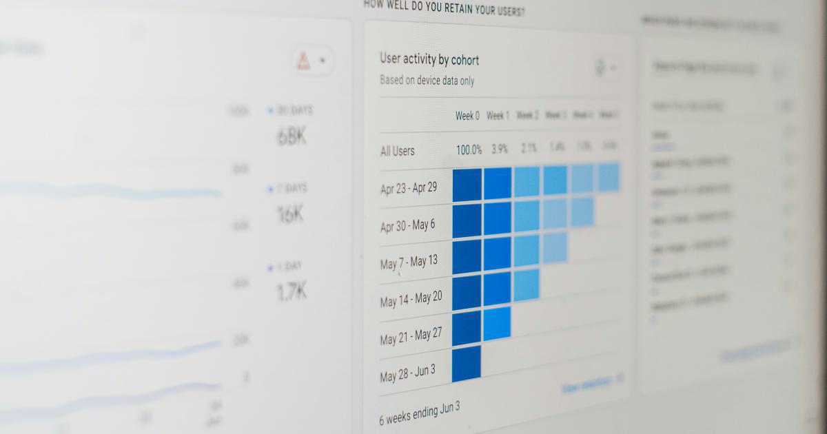
Heat maps use color intensity to represent the magnitude of values within a matrix or grid, making them effective for visualizing patterns and trends in large datasets.

When to Use:
- Displaying large amounts of data in a compact, visually intuitive way
- Identifying patterns, outliers, or hot spots within a dataset
- Comparing and contrasting values across a matrix or grid
Bubble Charts
Bubble charts use circles of varying size to represent data points, often used to display three-dimensional data by incorporating size as an additional variable.

When to Use:
- Visualizing three-dimensional data (two numeric variables plus size)
- Displaying the relationship between three variables
- Highlighting the relative importance or magnitude of data points
Treemaps
Treemaps use nested rectangles to represent hierarchical data, effectively displaying the relative size and relationship of different categories or subcategories.

When to Use:
- Visualizing hierarchical or nested data structures
- Comparing the relative size or importance of different categories
- Identifying patterns, relationships, or imbalances within a hierarchical dataset
Network Diagrams
Network diagrams, such as force-directed graphs or node-link diagrams, are useful for visualizing complex relationships and connections within a dataset.

When to Use:
- Exploring the relationships and connections between entities or data points
- Identifying clusters, communities, or influential nodes within a network
- Visualizing the structure and dynamics of complex, interconnected systems
Geospatial Visualizations
Maps, charts, and other geospatial visualizations are effective for displaying data with a geographic component, such as population distributions, sales territories, or transportation patterns.

When to Use:
- Displaying data with a clear geographic or spatial component
- Identifying patterns, trends, or anomalies within a geographic context
- Communicating the spatial distribution or concentration of data
Remember, these are just a few examples of common visualization types, and the choice will depend on the specific characteristics of your data and the insights you aim to convey. It's important to consider the strengths and limitations of each visualization type to ensure you select the most effective option for your needs.
Combining Visualizations
In many cases, a single visualization may not be enough to fully communicate the complexity and nuance of your data. By combining multiple visualizations, you can create a more comprehensive and informative presentation.

Some strategies for combining visualizations include:
- Using multiple visualizations side-by-side to provide different perspectives on the same data
- Nesting smaller visualizations within a larger, more contextual visualization (e.g., a line chart within a map)
- Employing interactive elements that allow your audience to toggle between different visualization types
- Presenting a sequence of visualizations that tell a cohesive story about your data
When combining visualizations, ensure that they work together harmoniously, complement each other, and collectively enhance the overall understanding of your data.
Best Practices for Effective Visualizations
To create truly impactful data visualizations, consider the following best practices:
Prioritize Clarity and Simplicity
Avoid cluttering your visualizations with unnecessary elements or overly complex designs. Focus on presenting the most essential information in a clear, easy-to-understand manner.
Ensure Consistent Formatting
Use consistent formatting, color schemes, and visual elements throughout your visualizations to maintain a cohesive and professional appearance.
Optimize for Accessibility
Ensure your visualizations are accessible to users with diverse abilities by considering factors like color contrast, text readability, and alternative text descriptions.

Leverage Annotations and Labels
Annotations, labels, and supporting text can help guide your audience and provide additional context to the data.
Continually Refine and Iterate
Seek feedback, test your visualizations with users, and continuously refine your approach to ensure you're meeting the needs of your audience.
Stay Up-to-Date with Visualization Trends
Keep an eye on the latest trends and best practices in data visualization to ensure your work remains current and relevant.
By following these best practices, you can create data visualizations that effectively communicate insights, drive informed decision-making, and engage your audience.
Conclusion
Choosing the right visualization for your data is a critical step in effectively conveying your message and driving meaningful insights. By understanding your data, defining your visualization goals, and selecting the most appropriate visualization types, you can create compelling and impactful visual representations that resonate with your audience.
Remember, the key to successful data visualization lies in balancing the complexity of your data with the clarity and simplicity of your visual presentation. Continually refine your approach, stay up-to-date with industry trends, and seek feedback to ensure your visualizations continue to evolve and meet the needs of your audience.