Data Visualization for Non-Designers Simplified


Opening Hook
Imagine a world where data is more than just numbers on a spreadsheet - a world where insights come alive, where stories unfold, and where the most complex information becomes captivating. As a non-designer, you might have felt intimidated by the idea of creating visually compelling data visualizations. But what if I told you that the power to transform data into meaningful, impactful visuals is within your reach?

In this article, we'll embark on a journey to unlock the secrets of data visualization for non-designers. We'll explore the fundamental principles, dive into practical tools and techniques, and discover how to harness the power of data to captivate your audience and drive real change.
The Journey Begins: Understanding the Basics
Data visualization is the art of presenting information in a visual format, turning complex numerical data into easily digestible, visually appealing graphics. It's a powerful tool that can help you communicate your findings, uncover hidden patterns, and make data-driven decisions.
The Power of Visualization
"A picture is worth a thousand words." This adage holds true when it comes to data visualization. By transforming raw data into visual representations, you can convey information more effectively, making it easier for your audience to understand and remember.
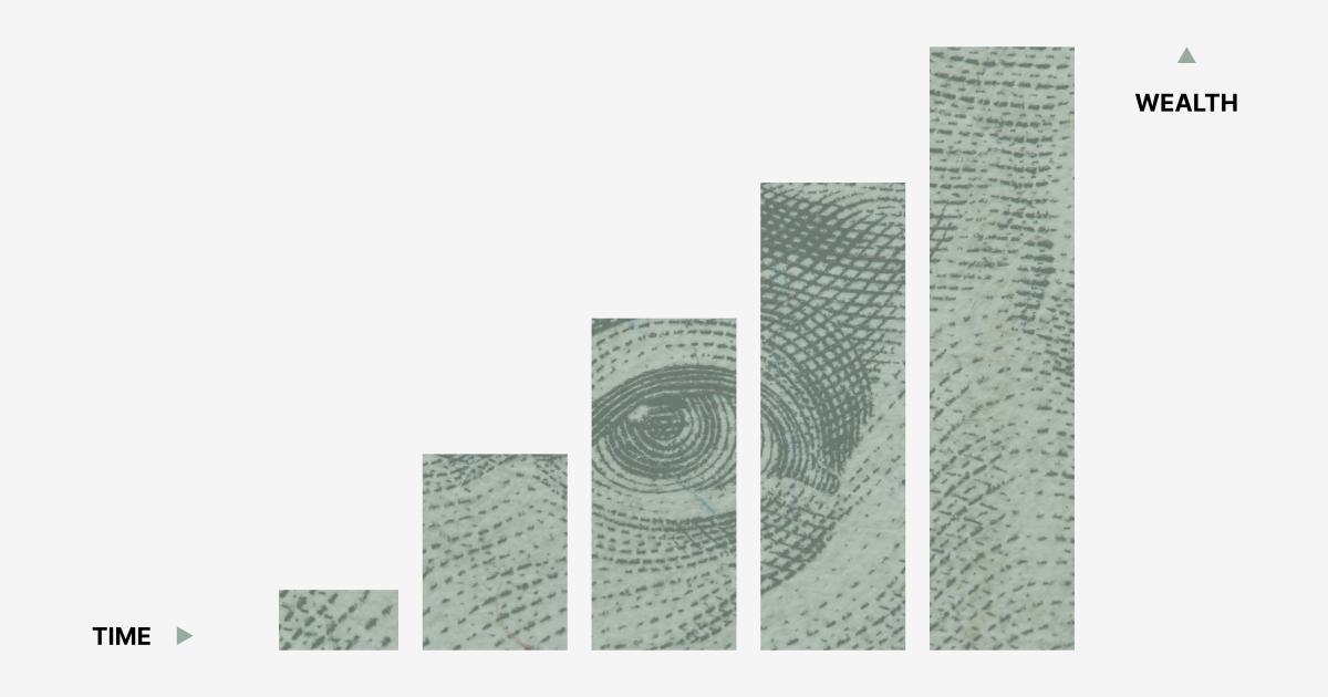
Effective data visualization can help you:
- Identify trends and patterns that may not be apparent in raw data
- Highlight key insights and make them more accessible to your audience
- Persuade stakeholders and decision-makers by presenting data in a compelling way
- Simplify complex information and make it more engaging and digestible
The Importance of Design Principles
While the power of data visualization is undeniable, the success of your visualizations depends on the application of sound design principles. As a non-designer, it's important to understand the fundamental elements of visual design, such as:
- Color: The strategic use of color can enhance the clarity and impact of your visualizations. Choosing the right color palette can help guide the viewer's attention and convey specific meanings.
- Layout: The arrangement of visual elements on the page can significantly influence the flow and comprehension of your data. Effective layout design can create a sense of hierarchy and guide the viewer's eye.
- Typography: The selection and use of fonts can impact the readability and overall aesthetic of your visualizations. Choosing appropriate typefaces and sizes can enhance the legibility and professionalism of your work.
- Hierarchy: Establishing a clear visual hierarchy helps the viewer understand the relative importance of different elements within your visualization. This can be achieved through the strategic use of size, placement, and emphasis.

By understanding and applying these design principles, you can create data visualizations that are not only informative but also visually captivating and engaging.
Choosing the Right Visualization Type
One of the critical decisions you'll make when creating data visualizations is selecting the appropriate visualization type. The choice depends on the nature of your data, the story you want to tell, and the needs of your audience.
Some common visualization types include:
- Bar Charts: Effective for comparing quantitative values across different categories.
- Line Charts: Ideal for representing trends and changes over time.
- Scatter Plots: Useful for identifying relationships and correlations between variables.
- Pie Charts: Effective for showcasing the relative proportions of a whole.
- Infographics: Comprehensive visual representations that combine data, images, and text.

The key is to choose the visualization type that best suits your data and the message you want to convey. As a non-designer, you can start with these standard chart types and gradually explore more advanced visualization techniques as you gain experience.
Crafting Compelling Visualizations
Now that you understand the fundamentals of data visualization, let's dive into the process of creating engaging and impactful visuals.
Telling a Compelling Story
Effective data visualization is not just about presenting information; it's about telling a compelling story. By weaving your data into a narrative, you can captivate your audience and guide them through the insights you've uncovered.
"Data alone is not enough. You need to tell a story with your data." - Cole Nussbaumer Knaflic, author of "Storytelling with Data"
To craft a compelling narrative, consider these key elements:
- Identify the Key Message: Determine the main takeaway or insight you want to convey to your audience.
- Establish a Clear Structure: Organize your visualization in a way that guides the viewer through the story, with a clear beginning, middle, and end.
- Incorporate Relevant Context: Provide relevant background information and context to help your audience understand the significance of the data.
- Highlight Meaningful Insights: Focus on the most important and impactful findings, and use visuals to emphasize these insights.
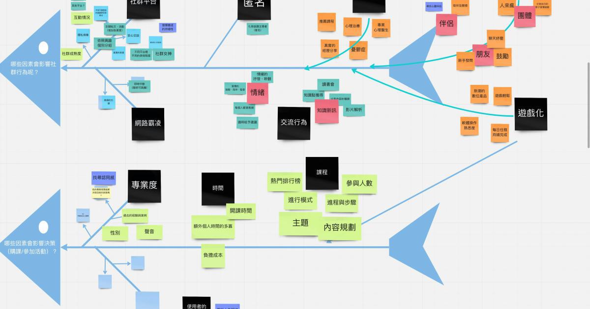
By weaving your data into a captivating narrative, you can create visualizations that not only inform but also inspire and engage your audience.
Maximizing Clarity and Simplicity
As a non-designer, it's important to remember that the primary purpose of your data visualizations is to communicate information effectively. Prioritize clarity and simplicity over complexity or visual flair.
Here are some strategies to help you achieve this:
- Limit the Number of Elements: Avoid overcrowding your visualizations with too many data points, colors, or visual elements. Stick to the essentials and let the data speak for itself.
- Use Clear and Concise Labels: Ensure that your axis labels, legends, and other text elements are easy to read and understand.
- Optimize for Readability: Choose appropriate font sizes, line spacing, and alignment to make your visualizations easy to scan and comprehend.
- Remove Unnecessary Clutter: Eliminate extraneous gridlines, borders, or decorative elements that might distract from the core message.

By prioritizing clarity and simplicity, you'll create visualizations that are easy to understand, engage your audience, and effectively communicate your insights.
Incorporating Interactivity
In the digital age, data visualization can go beyond static images and embrace the power of interactivity. By adding interactive elements to your visualizations, you can enable your audience to explore the data in a more dynamic and engaging way.
Some common interactive features include:
- Hover-over tooltips: Providing additional information or details when the user hovers over a specific data point.
- Filtering and sorting: Allowing the audience to filter or sort the data based on their preferences or interests.
- Zoom and pan: Enabling users to zoom in on specific areas of the visualization or pan across the data.
- Animation and transitions: Incorporating smooth transitions and animations to highlight changes or guide the viewer's attention.

Incorporating interactivity into your data visualizations can help foster a more active engagement with your audience, enabling them to explore the data more deeply and uncover insights that might have been missed in a static representation.
Choosing the Right Tools
As a non-designer, you may be wondering what tools and software you can use to create high-quality data visualizations. While there are many options available, here are some popular and user-friendly choices to consider:
Excel and Google Sheets
For those familiar with spreadsheet software, Excel and Google Sheets can be excellent starting points for creating basic data visualizations. Both platforms offer a range of chart types and customization options that can help you get started.

Tableau
Tableau is a powerful data visualization software that provides a user-friendly interface and a wide range of advanced charting and analytical capabilities. While it may have a steeper learning curve than some other options, Tableau is a popular choice for creating visually stunning and interactive data visualizations.

Canva
Canva is a versatile graphic design tool that can also be used to create data visualizations. With its drag-and-drop interface and extensive library of templates, Canva is an excellent choice for non-designers looking to create professional-looking charts and infographics.

Datawrapper
Datawrapper is a web-based data visualization tool that is particularly well-suited for creating simple, yet effective charts and maps. It offers a user-friendly interface and a range of customization options, making it a great choice for beginners.

The key is to choose a tool that aligns with your level of expertise, the complexity of your data, and the specific needs of your project. As you gain more experience, you can explore more advanced data visualization software and techniques.
Overcoming Common Challenges
As a non-designer, you may encounter a few challenges when creating data visualizations. Let's address some common hurdles and explore strategies to overcome them.
Dealing with Data Complexity
Large or complex datasets can be overwhelming, making it difficult to determine the most important insights to focus on. To address this:
- Start with a clear objective: Identify the key questions you want to answer or the main story you want to tell.
- Explore and clean your data: Familiarize yourself with the data, identify any inconsistencies or outliers, and prepare it for visualization.
- Prioritize the most relevant data points: Focus on the metrics and dimensions that are directly relevant to your objective.

Achieving Visual Balance and Consistency
Striking the right balance between design elements and maintaining visual consistency can be a challenge for non-designers. To overcome this:
- Establish a clear visual hierarchy: Determine the relative importance of different elements and use size, placement, and emphasis to guide the viewer's attention.
- Stick to a consistent color palette: Choose a limited number of colors that complement each other and use them consistently throughout your visualizations.
- Utilize grid-based layouts: Organize your visual elements using a grid system to create a sense of alignment and structure.

Effectively Communicating Insights
Translating your data insights into a compelling narrative can be a challenge, especially for non-designers. To improve your communication:
- Identify the key message: Determine the primary takeaway or story you want to convey to your audience.
- Use annotations and callouts: Highlight important data points or insights with text annotations or visual cues.
- Incorporate contextual information: Provide relevant background information or explanations to help your audience understand the significance of the data.

By addressing these common challenges, you can create data visualizations that are not only visually appealing but also effectively communicate your insights to your audience.
Continual Improvement and Feedback
Creating effective data visualizations is an ongoing journey, and as a non-designer, it's important to embrace a mindset of continuous learning and improvement.
Seeking Feedback and Iterating
Gather feedback from your audience, colleagues, or design professionals to identify areas for improvement. Use this feedback to refine your visualizations, experiment with new techniques, and continually enhance your skills.
"The best data visualizations are the result of an iterative process, not a single creation." - Alberto Cairo, author of "The Functional Art"
Exploring Online Resources
Take advantage of the wealth of online resources available for data visualization, such as tutorials, design inspiration galleries, and communities of practice. These can help you stay up-to-date with the latest trends, techniques, and best practices.

Embracing a Growth Mindset
Approach data visualization as an ongoing learning process, and be open to experimenting, making mistakes, and continuously improving your skills. Remember that even seasoned designers are constantly evolving their craft.
By adopting a growth mindset and embracing the journey of data visualization, you'll be well on your way to creating visuals that captivate, inform, and inspire your audience.
Conclusion: Unlocking the Power of Data Visualization
In the end, the journey of data visualization for non-designers is one of discovery, creativity, and impact. By understanding the fundamental principles, harnessing the right tools, and embracing a storytelling approach, you can transform raw data into visuals that captivate and compel your audience.
Remember, data visualization is not just about pretty charts and graphs - it's about unlocking the hidden narratives within your data, empowering your stakeholders, and driving meaningful change. So, embark on this journey with confidence, curiosity, and a willingness to learn and grow. The rewards of effective data visualization are truly limitless.