Optimizing Data Visualizations for Mobile Devices

As technology continues to evolve, the way we consume and interact with data has undergone a significant transformation. With the widespread adoption of smartphones and tablets, more and more people are accessing information on the go, using their mobile devices as primary tools for research, analysis, and decision-making. This shift has profound implications for the design and optimization of data visualizations, as these visual representations of information must now be tailored to the unique constraints and user behaviors associated with mobile platforms.
Understanding the Mobile Data Visualization Landscape
The rise of mobile devices has fundamentally changed the way we interact with data. Gone are the days when users were primarily confined to desktop computers or laptops when accessing and analyzing information. Today, mobile devices have become ubiquitous, with users expecting to seamlessly transition between various platforms and devices throughout their day.
The Challenges of Mobile Data Visualization
Designing effective data visualizations for mobile devices presents a unique set of challenges that must be addressed. These challenges include:

Limited Screen Real Estate: Mobile devices typically have smaller screens compared to desktops, which can make it challenging to display complex data visualizations without compromising legibility and clarity.
Varied Screen Resolutions: The range of screen sizes and resolutions across different mobile devices can make it difficult to create a one-size-fits-all solution, requiring careful consideration of responsive design principles.
Touch-Based Interaction: Mobile users interact with data visualizations primarily through touch-based gestures, such as tapping, swiping, and pinch-to-zoom. This interaction paradigm differs significantly from the mouse-based interactions common on desktop platforms, necessitating a rethinking of the user experience.
Diverse Usage Contexts: Mobile users often access data visualizations in a variety of settings, from quiet office environments to noisy public spaces. This diversity of usage contexts can impact the visibility, legibility, and overall effectiveness of the data visualization.
Shorter Attention Spans: Studies have shown that mobile users tend to have shorter attention spans compared to desktop users, placing a greater emphasis on the need for concise, easily digestible visualizations that convey key insights at a glance.

The Importance of Optimizing for Mobile
Given the growing importance of mobile devices in our daily lives, optimizing data visualizations for these platforms is crucial for several reasons:
Accessibility: Ensuring that data visualizations are accessible and usable on mobile devices allows a wider audience to engage with and extract insights from the information presented.
Competitive Advantage: Organizations that prioritize the optimization of their data visualizations for mobile devices can gain a competitive edge by providing their users with a seamless and efficient experience, regardless of the device they are using.
Increased Engagement: Well-designed mobile data visualizations can capture the attention of users and foster deeper engagement, leading to more informed decision-making and better-informed stakeholders.
Workforce Productivity: As more professionals rely on mobile devices for their work, optimized data visualizations can enhance productivity and decision-making capabilities, particularly in time-sensitive or on-the-go scenarios.
Consistent User Experience: Ensuring a consistent and cohesive user experience across desktop and mobile platforms can enhance brand recognition and customer loyalty, as users can easily transition between devices without sacrificing the quality of the data visualization.
Principles of Effective Mobile Data Visualization Design
Designing effective data visualizations for mobile devices requires a careful balance of visual clarity, user interaction, and responsive design principles. Here are some key principles to consider:
Simplify and Streamline
One of the primary challenges in creating mobile-optimized data visualizations is the limited screen real estate. To address this, it's essential to simplify the visual elements and streamline the information presented. This may involve:
- Reducing Clutter: Eliminate unnecessary visual elements, such as excessive gridlines, labels, or annotations, to ensure the core data and insights are the focal point.
- Prioritizing Key Metrics: Focus on displaying the most critical data points and KPIs, allowing users to quickly grasp the essential information.
- Leveraging Interactivity: Incorporate interactive features, such as zooming, panning, or hover-based tooltips, to allow users to explore additional details on demand, without overwhelming the initial view.

Optimize for Touch Interactions
Since mobile users interact with data visualizations primarily through touch-based gestures, it's crucial to design interfaces that are well-suited for this interaction paradigm. Consider the following:
- Larger Touch Targets: Ensure that interactive elements, such as buttons, legends, or data points, are large enough to be easily tapped by a user's finger, reducing the risk of accidental selections or frustrating interactions.
- Intuitive Gestures: Leverage common touch-based gestures, such as pinch-to-zoom, swipe to pan, or tap to select, to provide a seamless and familiar user experience.
- Responsive Design: Ensure that the data visualization adapts to the user's input, whether they are using their finger or a stylus, providing a consistent and reliable interaction experience.

Enhance Legibility and Clarity
Maintaining legibility and clarity is crucial when designing data visualizations for mobile devices. Consider the following strategies:
- Optimized Typography: Use clear, legible typefaces and ensure that font sizes are large enough to be easily readable on smaller screens, even in low-light conditions.
- High-Contrast Palettes: Choose color palettes with high contrast between data elements and the background, making the visualization easy to read and interpret.
- Responsive Layout: Implement a responsive design approach that adapts the layout and visual elements to the user's device and orientation, ensuring optimal readability and usability.

Optimize for Mobile Contexts
As mentioned earlier, mobile users can access data visualizations in a variety of settings, each with its own unique challenges. Consider the following:
- Accessibility for All Users: Ensure that the data visualization is accessible to users with diverse abilities, including those with visual, motor, or cognitive impairments, by adhering to accessibility guidelines and best practices.
- Visibility in Varying Lighting: Design the data visualization to be legible and easily interpretable in different lighting conditions, from bright sunlight to low-light environments.
- Optimized for One-Handed Use: Consider the ergonomics of one-handed use, placing the most critical interactive elements within easy reach of the user's thumb or index finger.
Provide Contextual Insights
Mobile users often access data visualizations on the go, with limited time and attention to spare. To ensure that the visualization effectively communicates key insights, consider the following strategies:
- Highlight Relevant Insights: Use visual cues, such as annotations, callouts, or data labels, to draw the user's attention to the most critical insights or trends within the data.
- Provide Concise Explanations: Accompany the data visualization with brief, contextual explanations that help the user quickly understand the significance of the information presented.
- Leverage Microinteractions: Incorporate microinteractions, such as hover-based tooltips or tapping to reveal additional details, to allow users to explore the data at their own pace without becoming overwhelmed.

Techniques for Optimizing Mobile Data Visualizations
To effectively implement the principles of mobile data visualization design, consider the following techniques:
Responsive Design Approach
Adopting a responsive design approach is crucial for ensuring that data visualizations adapt seamlessly to different screen sizes and device orientations. This may involve:
- Fluid Layouts: Utilize flexible grid systems and layout techniques that allow the visualization to adjust and reflow based on the available screen real estate.
- Adaptive Content: Implement strategies to selectively display or hide certain visual elements based on the device's screen size, ensuring that the most critical information remains visible and legible.
- Scalable Graphics: Use vector-based graphics or high-resolution raster images that can be scaled up or down without losing quality, ensuring a crisp and clear visualization across different devices.
Optimized Interaction Design
Designing intuitive and efficient interaction patterns for mobile data visualizations is essential. Consider the following:
- Touch-Friendly UI Elements: Ensure that interactive components, such as buttons, legends, or data points, are large enough to be easily tapped by a user's finger, with ample spacing between them to prevent accidental selections.
- Gesture-Based Navigation: Implement common touch-based gestures, such as pinch-to-zoom, swipe to pan, or tap to select, to provide a seamless and familiar user experience.
- Contextual Menus and Overlays: Leverage contextual menus or overlays that appear when the user interacts with specific elements, allowing them to access additional details or functionality without cluttering the initial view.

Data Visualization Optimization Techniques
In addition to responsive design and interaction optimization, consider the following techniques to further enhance the performance and effectiveness of mobile data visualizations:
- Progressive Data Loading: Implement strategies to load data incrementally, prioritizing the display of the most critical information first, and allowing users to load additional details on demand.
- Efficient Data Representation: Explore alternative data visualization types, such as sparklines, mini-charts, or small multiples, that can convey key insights while occupying minimal screen real estate.
- Offline Capabilities: Provide offline access to data visualizations, allowing users to view and interact with the information even when they have limited or no internet connectivity.
Best Practices and Case Studies
To better illustrate the principles and techniques for optimizing data visualizations for mobile devices, let's explore some best practices and real-world case studies.
Best Practices
Prioritize Simplicity: Avoid cramming too much information into a single visualization. Instead, focus on presenting the most critical data points and insights in a clear and concise manner.
Leverage Interactivity: Incorporate interactive features, such as zooming, panning, or hover-based tooltips, to allow users to explore additional details on demand without overwhelming the initial view.
Ensure Accessibility: Design for users with diverse abilities, including those with visual, motor, or cognitive impairments, by adhering to accessibility guidelines and best practices.
Optimize for Varied Contexts: Consider the diverse usage scenarios and environmental factors that may impact the visibility and legibility of the data visualization, and design accordingly.
Test Continuously: Regularly test the data visualization on a variety of mobile devices and in different usage contexts to identify and address any usability or performance issues.
Case Studies
Case Study 1: Improving Mobile Data Visualization for a Sales Dashboard
A sales organization recognized the need to optimize their data visualization for mobile devices, as more of their sales team was accessing the company's dashboard on the go. By implementing a responsive design approach, simplifying the visual elements, and enhancing the touch-based interactivity, the organization was able to improve the user experience and increase engagement among its mobile-first sales representatives.

Case Study 2: Optimizing a Financial Report for Mobile Accessibility
A financial services firm wanted to ensure that their quarterly financial reports were accessible and easy to navigate on mobile devices, as an increasing number of their clients were accessing the reports via smartphones and tablets. By streamlining the layout, using high-contrast color palettes, and incorporating microinteractions for additional details, the firm was able to provide a seamless mobile experience that empowered their clients to make informed decisions on the go.

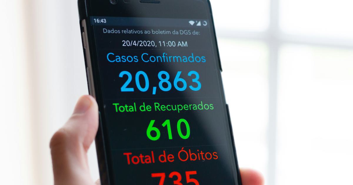
Case Study 3: Enhancing a Crisis Management Dashboard for Mobile Responsiveness
During times of crisis, government agencies and emergency response teams rely on data visualizations to quickly assess the situation and coordinate their efforts. By optimizing their crisis management dashboard for mobile devices, one agency was able to ensure that critical information was accessible and easily interpretable for field personnel, even in challenging environmental conditions, such as poor lighting or limited connectivity.

Conclusion
As the use of mobile devices continues to grow, the importance of optimizing data visualizations for these platforms cannot be overstated. By embracing the principles of simplicity, touch-based interactions, legibility, and contextual insights, organizations can create data visualizations that deliver a seamless and effective experience for their mobile-savvy users.
Through a combination of responsive design, optimized interaction patterns, and data visualization techniques, data visualization designers can ensure that their creations remain accessible, engaging, and impactful, regardless of the device or usage context. By adopting these best practices, organizations can unlock the full potential of mobile data visualization, empowering their stakeholders to make informed decisions and drive positive outcomes, even on the go.