Unleashing the Power of Interactive Data Visualizations


Introduction: The Rise of Data Visualization
In today's data-driven world, the ability to effectively communicate complex information is paramount. Data visualization has emerged as a powerful tool for transforming raw data into meaningful, impactful insights. By leveraging the power of interactive data visualizations, businesses, researchers, and policymakers can unlock the true potential of their data, enabling data-driven decision-making and fostering deeper understanding.

Interactive data visualizations go beyond static charts and graphs, allowing users to engage with the data, uncover patterns, and explore insights in real-time. By blending compelling visuals with intuitive user interfaces, these tools empower individuals to delve into the data, ask questions, and gain a deeper understanding of the underlying trends and relationships.
The Importance of Interactive Data Visualizations
In a world where data is exploding in volume and complexity, the ability to make sense of this information has become a critical skill. Interactive data visualizations play a pivotal role in bridging the gap between raw data and meaningful insights, enabling organizations to:
1. Enhance Decision-Making
Interactive data visualizations provide decision-makers with a clear, concise, and visually engaging way to comprehend and interpret data. By allowing users to explore the data, manipulate variables, and uncover insights, these tools enable more informed and data-driven decision-making.

2. Improve Storytelling and Communication
Data visualizations, particularly when designed interactively, have the power to transform complex information into compelling narratives. By crafting visually appealing and interactive data stories, organizations can effectively communicate their findings, engage their audience, and foster deeper understanding.

3. Foster Collaboration and Engagement
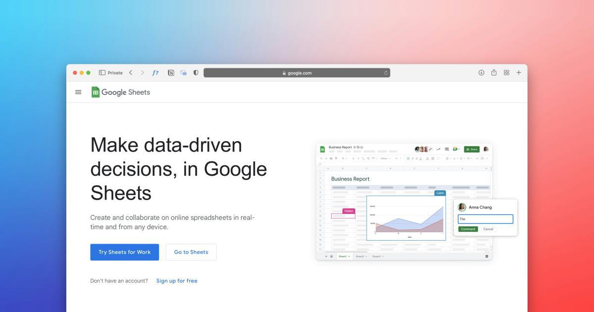
Interactive data visualizations encourage collaboration and engagement by allowing multiple users to explore and analyze the data together. This collaborative approach facilitates the exchange of ideas, the identification of shared insights, and the development of a data-driven culture within an organization.

4. Uncover Hidden Insights
The interactive nature of these visualizations enables users to dig deeper into the data, explore relationships, and uncover insights that may have been hidden in static representations. By allowing users to filter, sort, and manipulate the data, interactive visualizations unlock new perspectives and reveal previously unseen patterns.

Key Components of Effective Interactive Data Visualizations
Crafting impactful interactive data visualizations requires a deep understanding of data, design principles, and user interaction. The following components are essential for creating engaging and insightful interactive data visualizations:
1. Data Preparation and Cleaning
The foundation of any effective data visualization begins with the quality and relevance of the data. Careful data preparation, including cleaning, transforming, and organizing the data, is crucial to ensure the accuracy and reliability of the insights derived from the visualization.

2. Visual Design and Aesthetics
The visual design of an interactive data visualization plays a crucial role in its effectiveness. Thoughtful use of color, typography, layout, and other design elements can enhance the clarity, legibility, and overall aesthetic appeal of the visualization, making it more engaging and impactful for the user.

3. Interactivity and User Experience
The true power of interactive data visualizations lies in their ability to allow users to actively engage with the data. Intuitive user interfaces, smooth navigation, and seamless interactions enable users to explore, filter, and manipulate the data, uncovering insights that would be difficult to uncover in static visualizations.

4. Contextual Insights and Annotations
To maximize the effectiveness of interactive data visualizations, it is essential to provide relevant context and insights. This can be achieved through the inclusion of annotations, explanatory text, and additional data points that help users interpret the information and draw meaningful conclusions.

5. Responsiveness and Accessibility
In an increasingly mobile-driven world, it is crucial that interactive data visualizations are designed to be responsive and accessible across a range of devices and screen sizes. Ensuring a seamless user experience on both desktop and mobile platforms can greatly enhance the reach and impact of the visualization.

Leveraging Interactive Data Visualizations in Various Domains
Interactive data visualizations have transformative applications across a wide range of industries and domains, each with its unique challenges and requirements. Let's explore some of the key use cases:
1. Business and Finance
In the business and finance sectors, interactive data visualizations are instrumental in financial reporting, performance analysis, and strategic decision-making. They enable executives and analysts to easily identify trends, track key performance indicators, and uncover insights that drive operational improvements and enhance profitability.

2. Healthcare and Life Sciences
In the healthcare and life sciences domains, interactive data visualizations play a crucial role in understanding patient outcomes, tracking disease patterns, and optimizing treatment strategies. By visualizing complex medical data, researchers and healthcare professionals can identify risk factors, monitor ongoing trends, and make more informed decisions to improve patient care.

3. Public Sector and Government
Interactive data visualizations are invaluable tools for government agencies and public sector organizations, enabling them to enhance transparency, improve resource allocation, and drive policy decisions. These visualizations can be used to track budget spending, monitor program performance, and engage citizens in the decision-making process.

4. Educational and Research Settings
In educational and research settings, interactive data visualizations serve as powerful teaching and learning aids, helping students and researchers better understand complex data, identify patterns, and draw meaningful conclusions. These visualizations can also be used to present research findings in a visually engaging and impactful manner.

5. Social Impact and Nonprofit Organizations
Interactive data visualizations are becoming increasingly crucial in the social impact and nonprofit sectors, where organizations strive to measure and communicate their progress, impact, and resource allocation. These visualizations can help stakeholders, donors, and the general public better understand the challenges being addressed and the outcomes achieved.

Best Practices for Implementing Interactive Data Visualizations
Successful implementation of interactive data visualizations requires a thoughtful and strategic approach. Here are some best practices to consider:
1. Align with Organizational Goals
Ensure that the interactive data visualizations align with the organization's strategic objectives and decision-making needs. Engage stakeholders to understand their specific requirements and tailor the visualizations accordingly.
2. Focus on Data Storytelling
Craft interactive data visualizations that tell a compelling story, guiding users through the data and highlighting the most relevant insights. Incorporate contextual information, annotations, and narrative elements to enhance the user experience.
3. Ensure Data Integrity and Accuracy
Maintain a strong focus on data quality, constantly validating the accuracy and reliability of the information used in the visualizations. Regularly review and update the data to ensure it remains relevant and up-to-date.
4. Foster a Data-Driven Culture
Encourage a culture of data-driven decision-making within the organization. Provide training and support to help users effectively leverage the interactive data visualizations and incorporate the insights into their workflows.
5. Embrace Continuous Improvement
Continuously monitor the usage and feedback of the interactive data visualizations, and use this information to refine and improve the user experience. Regularly assess the evolving needs of the organization and update the visualizations accordingly.

Conclusion: Unleashing the Transformative Power of Interactive Data Visualizations
In the era of data abundance, interactive data visualizations have emerged as a transformative tool for unlocking the true potential of information. By blending compelling visuals, intuitive interactivity, and contextual insights, these powerful tools enable organizations to make better-informed decisions, enhance communication, and foster a data-driven culture.
As you embark on your journey to harness the power of interactive data visualizations, remember to focus on aligning your efforts with your organizational goals, prioritizing data integrity, and continuously refining the user experience. By embracing this powerful approach, you can unlock a new era of data-driven success and propel your organization to new heights.